Tuesday, June 20, 2017

The Great Wall Review


     2017 has actually been a pretty good year so far for my movie viewing experiences.  I'd only seen 12 2017 movies before sitting down to view The Great Wall and out of those 12, only 2 were duds.  I seem to recall a bit more of a balance by about this time last year so I watched this one, thinking that it might help pad out the Bad list.  I'll be completely up front with you, seeing the trailers for this movie did not make me excited one bit and Scholar and I figured that The Great Wall would end up being a hate watch, like what she did with last year's abomination Gods Of Egypt or our plans for this year's The Mummy.

      The story behind The Great Wall, conceived by Legendary Pictures CEO Thomas Tull and World War Z author Max Brooks, is that two surviving members of a platoon of European mercenaries have traveled to China to find out the secret of gunpowder.  After a strange encounter with a creature at their camp, William (Matt Damon) and Tovar (Predro Pascal) happen across The Great Wall of China, only to find it heavily guarded and patrolled by an army known as The Nameless Order.  William and Tovar are captured and find themselves caught up in The Nameless Order's ongoing battle with a race of beasts known as the Tao Tei.  Having some emotional baggage, William agrees to help the Nameless Order in their fight in hopes of personal redemption.

     Now that sounds pretty silly, right?  Saying it out loud doesn't really do the movie any favors and the aforementioned trailers didn't help so I sat down with a big glass of Crown and Coke and gave it a watch...

     ...and Goddamn it, I kinda liked it.

Hey, I'm just as surprised as you are, Jing Tian.
      First of all, this is a pretty good looking movie.  There is a lot of sweeping landscape shots and a great sense of scale when getting good looks at both the wall and Bianliang later on, showing just how massive the threat they face is and even when the Tao Tei horde isn't featured onscreen, the cinematography is really nice during these moments.  When our characters reach the Wall, the movie receives a nice injection of color that the first few minutes sorely lacks with somewhat Blizzard-esque armor and weaponry being sported by The Nameless Order gives the aesthetic a more vibrant feel.  Kudos to Weta Workshop in this department because that looked great.
     Another thing that looked good was the action scenes when The Nameless Order engage the Tao Tei in combat.  The shots and editing used during these moments were clear, coherent and not so overdone that you couldn't see what was going on, which was good because this allowed the movie to unleash some brutality during these moments that I thought were pretty intense for a PG-13 movie.  The Great Wall doesn't really shy away from the fact that The Nameless Order are just as likely to get mass casualties just as the Tao Tei.  Naturally, it's not as brutal as something like Hacksaw Ridge but I was surprised by some of the shots showing what became of some of the soldiers during these fights.
     If I had to pick one thing that I enjoyed the most about this movie, it would be the score.  It was actually the first thing I noticed just as the movie was starting up.  Ramin Djawadi's music has the feel of your typical major Hollywood blockbuster but there was also a playful undertone to it which gave me flashbacks to Klaus Badelt's score for the first Pirates Of The Caribbean film.  I'm listening to this soundtrack as I write this review and to be honest, I would buy it.

Just wanted an excuse to show these costumes.
     However, a great movie The Great Wall is not.  One of the biggest problems I had with it, now that I think about it, is that there a couple of side characters in this movie that just do not need to be here.  Pedro Pascal and Willem Dafoe's respective characters don't really add much to the story other than an obligatory human threat to the well being of The Nameless Order and the pacing of the movie suffers whenever they're on.  Their performances are fine (actually, everyone is fine in this movie although it takes Matt Damon a few minutes to really get into it) and I don't have anything against the actors but they just weren't that interesting to follow.  Whenever Tovar and William would get into a spat, I found myself wanting to get back to The Nameless Order stuff, not because of the action and the costume designs but their ranks, hierarchy and way of life was more engaging and even then, I wasn't completely wrapped up with those characters either.  Pascal and Dafoe's characters could've been cut from the movie and I don't think much would've really been lost.
     I am also on the fence about the Tao Tei's designs.  They grew on me a bit more as the film progressed but the first good look you get at them 19 minutes in left me feeling very underwhelmed at the designs and, well, you only get one chance at a first impression.  Other than that, there's your typical blockbuster movie nitpicks: some bad greenscreen near the beginning of the film, it gets very, VERY CGI heavy at the end and it doesn't always look the best and I can imagine there's probably a lot of people who were mad/disappointed at a tease of a big action sequence that we only ever saw the aftermath of.
     
     In the end...yeah.  The Great Wall is not the wreck I was expecting it to be.  It's not a game-changer in the action movie genre, the dialogue isn't Tarantino levels and there's very little humor to be had here but it is an enjoyable, CG creature-feature war film with some pretty intense action sequences and an overall fun feel to it.  I'm not saying I'd run out and buy the Blu-Ray full price but if I found it in the cheap bins, I'd honestly pick it up.  I'm giving The Great Wall the ranking of a Fun Ride.

Wheeee!
      So folks, what did you think of The Great Wall?  As always, thank you so much for reading and if you like what you see on this blog, you be sure to nudge that "Follow" button and stay cynical!

     -The Cynic

Saturday, April 15, 2017

Nine Lives Review


     As someone who really likes watching movies and listening to/partaking in discussions about them, sometimes a movie will come up that is notoriously bad, like "the reputation precedes it" bad and sometimes, against one's better judgement, a person may find themselves seeking out the film in question to say, "Okay, let's see if it is really that bad."  Well, that was me with Nine Lives and thanks to Netflix, I was able to see it and we're gonna talk about it.

     Nine Lives stars Kevin Spacey as Tom Brand, a multi-millionaire business man who is too obsessed with his company that he more or less completely neglects his second wife (Jennifer Garner) and daughter (Malina Weissman).  He goes to buy his daughter a cat (even though he can't stand them) but something happens at his office building that puts his body in a coma but his mind is now in the cat that he bought.  So now he has to save his marriage, his company and his human body while being a cat.

Yeah, I made this face reading that part too...
     So...where to begin?  Well, I noticed that the movie wastes very little time turning you off of the overall look of the thing.  After the movie opens with some cat videos pulled from FailArmy montages, the camera shoots up from two most-likely CGI kittens playing on the shore of a river upwards past the skyline of Manhattan and up to a plane Spacey is about to parachute out of and not a frame of it looks convincing.  The speed that the shot zooms up coupled with the awful green screen and CG effects make for a very unpleasant sight and it doesn't stop there.  At the 3:28 mark, everything in the movie took on a very plastic, overly synthetic look and I groaned when I realized I still had another 85 minutes to go.  Every scene transition feels just as unpleasant as that zooming to the plane shot, whether it'd be a zooming shot through the scaffolding of Spacey's new tower that would make CSI demand the movie dialed it back a little, the cartoony closing black circle transition or just the fact that the movie jumps all over the place without giving us much to latch onto story-wise.
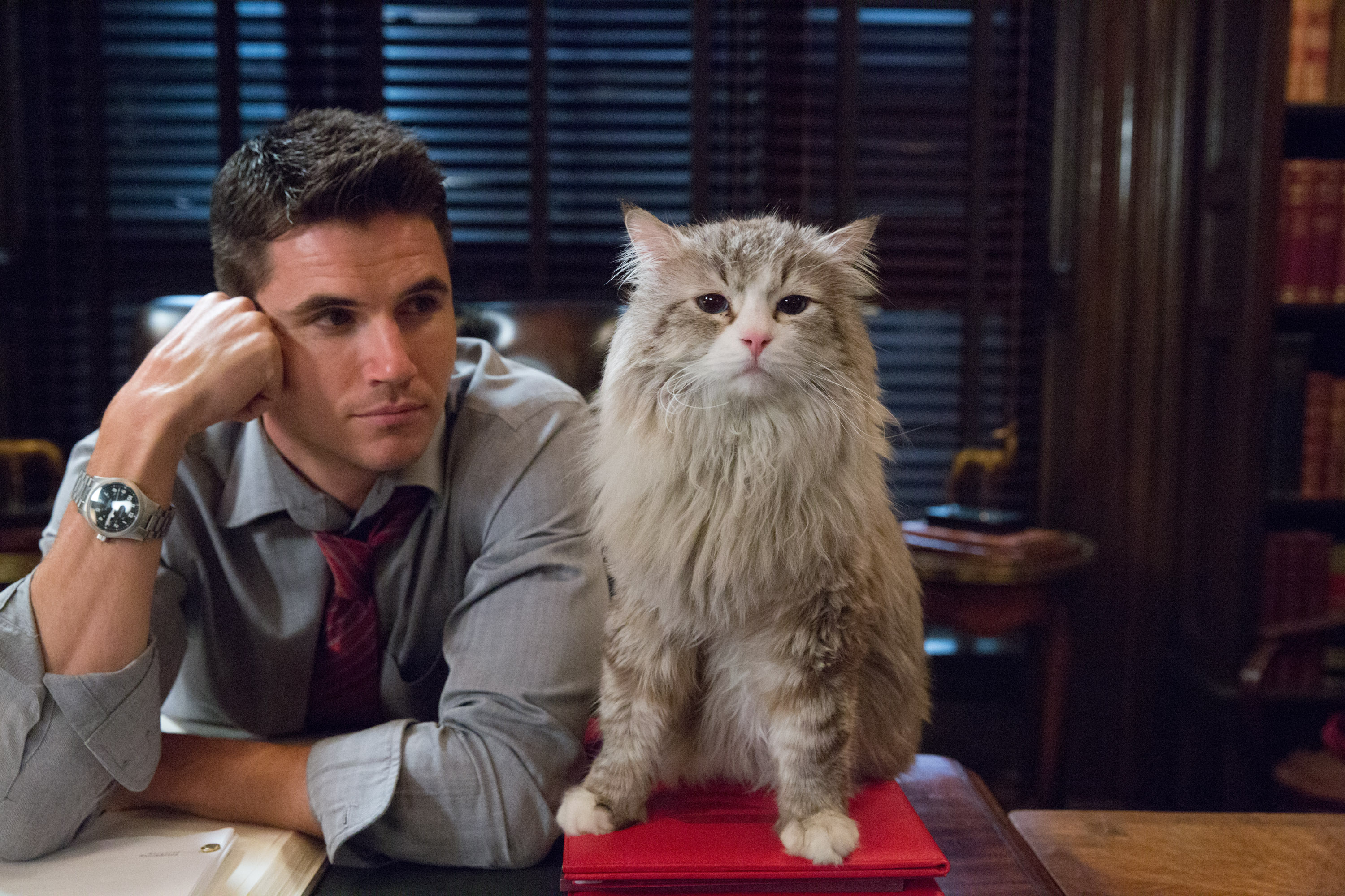
     The cast here seems really disinterested in the whole affair.  Spacey seems alright when he's in human form but once he becomes a cat, his line reading sounds similar to the opening of The Last Airbender where it sounded like instructions being read off the back of a pizza box, specifically his realization of his situation.  It's not Matthew Perry in Fallout: New Vegas bad but it's still bad.  Garner and Weissman are serviceable, I guess but nothing really stood out about them.  I think I may have been distracted by the presence of Spacey's ex-wife (Cheryl Hines) and her daughter (Talitha Bateman), who keep popping up because Garner and Hines' characters are apparently friends but I didn't buy it.  Hell, I bought the rift between Weissman and Bateman even less as the forced conflict they had is as synthetic as the look of the film.  Christopher Walken is doing his usual Walken thing while Mark Consuelos' Ian comes off as the most cartoony aspect of this movie and the whole time he was on, I kept thinking he looked like a discount bin version of Oscar Isaac.  Robbie Amell is in this as well as Spacey and Hines' son but I never really got a sense of what his job actually was and it turns out he just basically became a plot device to thwart Consuelos in the end.

"Why are we here, cat?"  "I ask myself the same thing, Cousin of Arrow."
     As for the special effects, remember the Garfield movies?  Yeah, when the cat is CG, I had flashbacks to that and while I do remember Garfield not being as bad as it could have been, the CG there was bad by 2004 standards as is the case here.  Sure, the cat's overall design here is more believable since when it isn't CG, an actual cat is used but the CG sticks out like a very sore thumb.  This movie had a budget of $30 million but most of that went to the cast me thinks, leaving the visual FX team very little to work with.
     
     Look, I didn't go into Nine Lives expecting anything great, or good for that matter.  Yet, I still found myself disappointed once I reached the end credits.  Why, you ask?  Because Nine Lives' greatest offense is that it is just boring, which (depending on who you ask) could actually be worse than infuriating because at least when a movie pisses you off, you feel something.  There isn't the bludgeoning of extremely nauseating CGI and acting like Gods Of Egypt, the heavy-handed obnoxiousness of Mike & Dave Need Wedding Dates or even good ideas gone awry like Batman vs Superman, instead we're left with a film that almost seems like it is actually putting effort into being not interested in its own existence.  Most people walk away from a movie disappointed that they didn't like it more but here I'm disappointed that I didn't dislike this movie more.  Nine Lives is just another one of those movies where it doesn't try because it is aimed at kids, where I've said before just because you're aimed at a certain demographic doesn't mean you shouldn't try.  This movie may not have infuriated me like it has others but if you haven't seen it yet, keep it that way because it still sucks and with that, I'm giving Nine Lives the rating of a Throwaway.

Get the fuck outta here!
      Feel free to sound off below, what did you think of Nine Lives and what is your favorite or least favorite talking animal movie?  Thanks for reading and if you like what you see on this blog, be sure to nudge that "Follow" button and stay cynical!

     -The Cynic

Thursday, March 23, 2017

Passengers (2016) Review (Minor Spoilers)


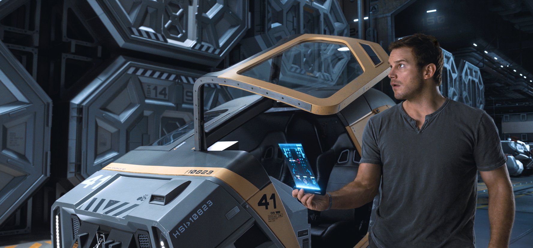
     Passengers is a space drama directed by Morten Tyldum and stars Jennifer Lawrence & Chris Pratt as two people (out of 5000) aboard a spacecraft in the future that is en route to a new colony on another planet.  Easy enough but the trouble is the voyage is supposed to take 120 years; Jim Preston (Pratt) and Aurora Jane (Lawrence) have been awakened from their stasis pods 90 years early.

     I remember watching the trailer for this one when it hit the web in September and to be honest, I wasn't sure what to think of it.  It didn't look bad but I wasn't exactly chomping at the bit to see it, even if it did have star power like Katniss Darkholme and Peter Grady.  I kept it in the back of my mind as one to look at once it hit rental (this opened the same weekend as Rogue One so our priorities were elsewhere) and now that it has done so, I plunked down and gave it a watch.  I'm not going to try and get too specific but I do need to address a couple of events that might be considered minor spoilers.

     Jim checking his map, making sure he isn't on the Sulaco.

     The first (and best) thing I noticed with Passengers is the score, which I absolutely loved.  Composer Thomas Newman loves his piano apparently as he fills the softer and more awe-inspiring scenes with a piano-focused but a touch of electronica score that I could not help but compare to the score from Bioware's Mass Effect series while also keeping that more traditional action scene music handy for when things really go wrong but even then, he can't keep the piano and electronica out of those.  The soundtrack here can be beautiful and ominous all at once and it is absolutely great, well worth a listen.
     
     Unfortunately, that's all I can say that I undeniably loved about this movie as the rest of it is something of a mixed bag.  I like the leads of Lawrence and Pratt and they do have some pretty good chemistry and charisma onscreen together.  Even though Lawrence is top billed, this is very much Pratt's movie as his character awakens first and it was interesting to see him go through something along the lines of the Kubler-Ross Five Stages Of Grief Model.  In fact, I wish that this could've gone on longer (or have just been the whole movie) because I thought that when Jim considers suicide via air-lock 24 minutes into the film, it felt too premature.  At this point in the story, he's been on his own (unless you count Michael Sheen's android bartender Arthur) for just over a year and I get why Jim would want to try this but it didn't feel like it had been a year.  Since the movie isn't interested in being Cast Away IINNN SPAAAAACCEEE, Aurora is introduced shortly after this scene and then the movie felt like it picked up in pace, rushing through the highs and lows of their relationship.
     Looking over my notes again, it becomes clear that once Jim and Aurora's relationship tanks the movie doesn't offer a whole lot in terms of substance.  It's not like Jim goes all psycho over the fact that he's alone again despite not being the only person awake on the ship or Aurora finds something that Jim hasn't tried to reactivate their pods, they just sort of...exist.  Another character gets introduced at the 1hr 12min mark but they're only around for, what, literally ten minutes?  I would wonder why the movie even bothered introducing this character but obviously its for plot convenience so the story can attempt to build up suspense and tension for a finale on the exterior of the ship that probably sounds cool when you hear it but lacks that sense of peril in execution.
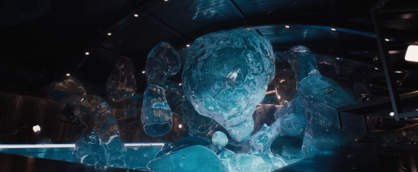
     As far as other technical things go, the only thing that stood out was that I was not overly impressed by the CGI in this movie.  There were a few dodgy green screen moments as well as CG effects that were not very convincing and these damaged the sense of immersion that I usually feel when watching a movie.  I will give credit though to the Zero Gravity Pool sequence though, where the onboard gravity malfunctions while Aurora is swimming and she gets trapped in a floating bubble of water.  Not only did the CGI look the best here but in order to really sell Aurora's predicament, Jennifer Lawrence was tied down in a water tank for authenticity.  Method acting for the win!

"Go for a swim," I said.  "It'll be relaxing," I said...

     In the end, Passengers is a movie that I'm glad I didn't see in theatres because I feel like I would feel more bitter towards it if I had.  The quality starts to dip after the first twenty minutes or so and that's a shame.  There are moments where you think the plot is going to go a certain way but then it goes a far less interesting route and it does that a few times leading up to an ending that doesn't so much feel like an ending but an abrupt stop that'll make you say, "That's it?"  Do I hate this movie?  No, I don't feel like I want the 110min runtime of my life back but I'm not in any rush to revisit the Avalon any time soon.  I liked Pratt, Lawrence and the score but the rest of it overall is pretty "Meh," and with that I'm giving Passengers the ranking of Indifferent.

 Yeah, that happened.

     What did you guys think of Passengers?  Good, bad or meh, let me know down in the comments below.  Thanks for reading and if you like what you see on the blog, be sure to nudge that "Follow" button and stay cynical!
     -The Cynic

Thursday, March 2, 2017

Nocturnal Animals Review


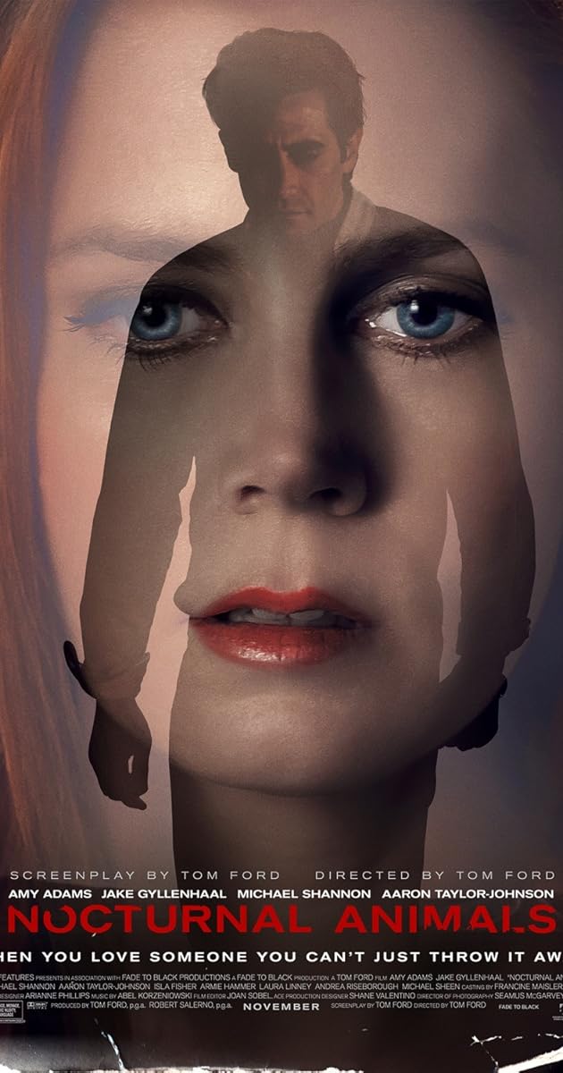
     Nocturnal Animals is based on the 1993 novel Tony And Susan by Austin Wright.  Directed by Tom Ford and starring Amy Adams, Jake Gyllenhaal, Michael Shannon and Aaron Taylor-Johnson, it follows the story of an artist named Susan who is sent a manuscript of a novel written by her ex-husband Edward.  While she is reading the book, she finds herself not only becoming wrapped up in the violent events on the page but she also begins to reminisce about her life with Edward, rethinking some of the decisions she made in her life.

     So in all honesty, this movie kind of fell under my personal radar as far as movie watching goes.  Sure, I had heard of it but anything I had seen didn't jump out and grab me and say, "Hey!  You need to see this right now!"  However, it recently hit digital rental and I said, "Hey, let's give it a shot."

     First, the good. I found that the score by Abel Korzeniowski was haunting, intoxicating and gorgeous and I found myself tilting up my ear whenever it was on.  It felt like it would fit right in a classic horror movie so that's always welcome, as far as I'm concerned.
     While the cast here is overall pretty good, so much that I even wrote in my notes that I would just like to see a movie of Adams and Gyllenhaal sitting at a restaurant table casually talking.  That being said, there are a couple of real standouts that I'd like to address.  First off, Aaron Taylor-Johnson.  Holy shit, I had no idea that Ford Brody/Pietro Maximoff could be so unsettling.  Johnson plays this despicable human named Marcus Ray and I could feel my fingers tightening into fists and my shoulders tensing up whenever he was onscreen.  The other is Michael Shannon as Detective Bobby Andes.  This is one cop that I would NOT want on my trail, especially later on in the movie when his motivations become a little more...laid back, we'll say.  I don't really want to go too much into it in case you haven't seen this one yet but these two deserved the recognition they received with any awards and nominations they got for this movie.
     Last thing I want to talk about the overall look and cinematography of the movie.  Writer/director Tom Ford is a fashion designer so he is able to take his know-how of catching a person's eye visually and applies it into his direction which creates some real eye candy, not just the fact that Amy Adams has never looked as good in a movie as she does here but some really great shots like where some moments of the book overlap with shots of the real world.  Really good stuff.

     As for any negatives?  Well, notice how most of the praise I gave was to the events set within the novel Susan is reading?  That's because that's when the movie is at its strongest.  The real world stuff with Susan hating her job, her overly conservative mother (Laura Linney), correctly suspecting that her current husband Hutton (Armie Hammer) is cheating on her, I get that she is going through a lot of crap but at the same time, how Susan carries herself even in some of the flashbacks, she just comes off as being a very unpleasant individual to be around and I didn't find her terribly sympathetic.  I get that this movie has two plots and you have to focus on the two as equally as you can but whenever it stepped out of the novel, I found myself saying, "What?  No, no, stop, just go back to the book."  I got just over halfway through the movie before I got fed up and wrote down in my notes, "I officially don't care about the events outside the book."  It doesn't matter how long it takes to get there, when the viewer reaches a point where they no longer care about characters they're supposed to be following or root for, that's a big problem.  Especially when in the first thirty minutes or so I couldn't shake the feeling that this movie might end up talking down to me like High Rise did (thankfully, it didn't).
     There's also a couple little things that bugged me, like some lines of dialogue coming off as a little cheesy or forced or a really silly jump scare that really didn't need to be in the movie but on a technical level, Susan says that she hasn't spoken to Edward in 19 years and yet in the flashbacks, neither Adams or Gyllenhaal look any different than they do in the present.  Don't get me wrong, they're two very good-looking people but this just bugged me that it seemed like NO effort was put into making them look even slightly aged.  I get that this is a weird thing to get hung up on but it was just another thing that really distracted me and made me want the movie to go back to the events in the book.

     In summation, Nocturnal Animals is an interesting movie to watch.  While the plot-within-a-plot structure is neat, the novel world material completely overshadows the material set within the real world and makes a part of you wonder why we couldn't have just seen a movie about that.  However, the movie ends with a seemingly open-to-interpretation final shot that really gets you thinking and I can appreciate a movie that does that.  There is an explanation to the ending that I unwittingly stumbled upon and while it does make sense, there is a certain enjoyment to letting your mental gears whir and cobble together your own explanation.  I was torn between what rating to give it and even though I had some issues with one of the plots, the other is just that damn good and engaging that I feel like I would be selling this film short if I didn't give it this rating so I'm giving Nocturnal Animals the rating of a low Excellent.

 Excellent!  *guitar peel*

     I almost gave this movie a high Fun Ride but like I said, the stuff that takes place within the book is such a good movie in its own right, it should be classified as an Excellent.  What did you think of Nocturnal Animals?  Let me know down in the comments below and be sure to stay tuned to both the blog and the YouTube channel for upcoming reviews *cough*Logan*cough*.  Thank you so much for reading and if you like what you see here, you be sure to nudge that "Follow" button and stay cynical!

     -The Cynic
Sunday, February 5, 2017

Mattel Batman vs Superman Wonder Woman Makeover


                Hey, everyone!  Doing something a little different with the blog this time and am showing you the process of repainting an action figure.  If you’ve watched my YouTube channel, you know that I have repainted many dinosaur figures to put on display as a backdrop and that I've mentioned we watch a lot of Cosplay Chris in our house (If you haven't watched his stuff yet, WATCH HIS STUFF).  While I do love me some dinosaurs and they’re fun to paint, I decided that I wanted a challenge and to step out of my comfort zone.  So while in my travels, I came across this:


                This is the basic Wonder Woman figure by Mattel from Batman vs Superman and I thought to myself, “Now there’s a challenge!”  This is fine as a basic action figure but imagine if someone were to put more details in the armor, add some character to the sword and shield, make Diana not so pale, etc.  I have never repainted a human figure before and while I’ve made it no secret that I was underwhelmed by either cut of BvS, Wonder Woman was one of the better parts of it and again, I want a challenge.  Basically, we’re gonna take this…


                …and try to make it appear something more like this


                …in terms of coloration, anyway.  I don’t know how to put in more articulation joints for better posture or grind down the sword for a better length.  This is strictly a cosmetic upgrade for a figure that has potential but just needs more attention to it.  This is going to be a very picture-heavy post so if your browser of choice is effected by that sort of thing, my apologies in advance.

     So what do we need?  First, we wash the figure with hot, soapy water so we have a clean surface to work from.  Next, we need paint.  Use acrylic paints too because they just clean up with soap and water and the alkyd paints just seem to flake off too easily from the final product.


                I’m starting with the armor using these metallic gold and silver paints.  This stuff works well but it is kind of a pain in the ass to apply as it goes on so thin, opting more for sheen than color so don’t be surprised if in your projects if you have to do multiple coats to get the color you’re looking for, especially with the gold.  So we take the gold and start brushing over the golden lines on her leg armor to give them a more metallic feel to them.


     The leg on the top has the paint added onto it and you can already see the sheen coming out and livening up the gold.  In order to get the full effect, I had to put about...three coats, I think.  So once Those were done, it came time to add gold to the other parts of her boots.


     This is where that "pain in the ass" thing I mentioned earlier comes in.  The furthest leg has had some gold added to it and while it does have the neat optical illusion of making the red on that boot seem darker, you can still see how much of the red is still bleeding through.  In order to get the full effect of the gold here, I think I had to put something like five or six coats and then leave it for a couple of days.


     Up next was Diana's golden lasso and this was pretty easy to do.  The lasso was originally colored the same as her golden belt and boot accents but I wanted the lasso to stand out so I just took the same yellow paint that I use for painting theropod eyes and covered the lasso.  Thankfully the plastic on this part was pretty flexible so I could pull the lasso away from the skirt so that the yellow didn't smudge onto the blue.


     Okay, so what I'm doing here is dry brushing some of that metallic silver paint around the edges of Diana's skirt to give it that worn metal look.  In order to get this effect, you basically need to have very little paint on your brush and just gently swipe at the edges so that it looks like the color has worn away.  Once I had finished the skirt, I looked back at the reference pictures and saw that I didn't need to dry brush every single edge but fuck it, I like how it looks.


     Earlier I had mentioned that I found this figure to be very pale, like it really needed to go out and get some sun.  If you're coming from Themyscira, you're gonna have some color to your skin and even Gal Gadot is not that pale.  So in my travel, I acquired some flesh-tone paint and recoated all of her exposed skin with the color.


     However, since this figure is articulated, I came across this particular problem.  No matter how long I let the paint sit, it would just come off once you moved the articulated joints so I came up with the idea of putting Wonder Woman on a stand in a fixed pose.  No movement, no paint removal.


     So I found a few pieces of wood laying around from past and current projects (we're cannibalizing some old wood to make book shelves above Scholar's desk right now) and put this together.  I put the little block on top with a piece of splintered wood on the back and held them in place using a combination of model glue and little nails that protrude enough so that they will fit into the holes in the soles of Wonder Woman's boots.  Once the glue and flat grey primer set, I used our jigsaw to cut the base into a more manageable size.

    
     Up next was the shield, which was completely flat grey.  I looked up a few reference pictures and found that the shield had a navy blueish base so I grabbed my bottle of dark blue and covered it entirely.  Then, I went over the bird and first ring with the gold paint (pictured above) and then went over the second ring and outer rim with the metallic silver.


     Speaking of that metallic silver, now it came time to add the silver scuff marks along the edges of her armor.  This was probably the most time consuming process because not only did I have to the legs but I also had to add silver to her belt, gauntlets and tiara/crown.  It sounds really tedious to have to gently swipe at the edges of all of those spots but it really does bring the figure to another level with these little details.


     Next came the face.  This was the part I was dreading the most because I fucking hate painting eyes.  Holy crap, I hate painting eyes, even on the dinosaur figures I repaint because nine times out of ten, they turn out cross-eyed.  However, the original figure just had eyebrows and the iris but no sclera or pupil so it looked very off.  So I held my breath, steadied my hand as best I could and repainted her eyebrows and iris while adding sclera and pupils.  As you can see in the picture above, it turned out a little cross-eyed so I went back and did it again and I think it worked out better...I think.


     I found myself at a bit of a loss as to what to do with the base because like I said, I didn't like Batman vs Superman (it was actually #4 on my Top Ten Worst Movies Of 2016) and I would've rather not sit through the final fight with Doomsday again.  However, looking at the flat grey of the primer, it actually reminded me a lot of the World War One footage from the Wonder Woman trailer so I decided to make the base look more like that.  I painted the front a sandstone color while painting the back splinter brown so that it would look like the broken piece of wood that it was and then I decided that I would cover the top of the base with dirt and stones that I had in my basement (it's an unfinished concrete basement so there's plenty to go around).


     So an interesting thing happened when I put the glue on the top to make the debris stick.  Apparently you can put paint over the dried glue but not the other way around because as I was brushing onto the sandstone block, the paint started to peel off with each stroke and revealed the primer underneath.  However, if this is supposed to be a war torn place Wonder Woman is fighting in, there would be blast and scuff marks along stone surfaces like this so I went with it.


     So after brushing glue across the top and sides, I brushed and placed some small pieces of concrete and dust along the piece to give it that look of debris and dirt tossed about from weapons fire.


     I thought the front of the base looked too plain so I painted the front, sides and underside black and basically turned the front into an ad for the upcoming film.  #pleasedontsuck


     Okay, so I decided that if Wonder Woman is going to be fixed onto the base, her pose might as well be as fixed as possible so this is just me brushing some glue onto the handle of the her sword (after I've painted it) so that it will always be in her hand.  I forgot to take pictures of a couple of steps so I'll add those in here:
     -I added some paint to her left hand gauntlet and the handles of her shield so that it would stay in place
     -I repainted her hair and leather strap she wears the same color as her eyebrows because her hair looked too dark on this action figure.
     -For the red torso armor, there seems to be noticeable black lines shown in the film where the plates meet but not on the action figure so I painted those lines as best as I could (I didn't attempt to take off the strap or her head because I would be good and goddamned if I got this far only to break the figure) and once the black had set, I went over her torso armor with a brush-on satin clear coat to give it a more shiny, metallic feel to it.
     -After testing the figure's stance, I added extra glue to the nails on the base as well as the soles of her boots.  Once putting the figure on and still finding it a little wobbly, I added more glue on the sandstone to ensure maximum hold.

     Okay, the clear coat has taken hold and I think we're ready for the full reveal.


     So there you have it!  I honestly can't tell you exactly how long this took because I did this over the course of a few weeks between work, family life and doing movie reviews but for my first human repaint, I'm actually pretty happy with how it turned out.  If you really like how this looks, hold that thought because what I'm going to do is take another look at this tomorrow with fresh eyes, do any touch ups as needed and then I will be putting this girl up for sale on my eBay store (along with maybe a couple other things I've repainted) so if you want to be on the up and up on that, make sure that you follow Coffee With The Cynic on Facebook and YouTube or Late Nite Scholar's Twitter.

     Thank you so much for reading, guys and gals and if you like what you see on this blog, you be sure to nudge that "Follow" button and stay cynical!

     -The Cynic